Research - week 11- 7/05/2019
Final painting plan
For my final poster the painting size is roughly the same size as a A1, it is on a half cotton half mix blend cold press. I have also started to plan the presentation of my poster in how it will be layed out in the RAW Gallery. I have talk to Kathrine about painting and printing on the walls and have been granted permission to do so.
My Idea is based around the poster being framed by words that have been printed on the wall. Which I thought would make the work stand out from the wall and be more dimensional and less flat and boring. the only thing Is I have to figure out what to print on the wall, and what typography to use and what will be the most visually pleasing way to do it. As I don't want it to be so cluttered to the point it looks messy and not pleasing to look at and the words become a distraction from the painting itself. Also want it to look cohesive and be one work together and not look like two separate works put together. I am also considering if I should not do a slogan, though I like the I can and I will slogan I used on my test paintings I don't think I should use it again for my final. I what to be a bit more in your face. this is made me think about using more graphite type typography, or type writer typography.
 |
| https://www.123rf.com/photo_95524747_stock-vector-handwritten-graffiti-font-alphabet-artistic-hip-hop-typography-collection-custom-vector-calligraphy-.html |
 |
| http://kenbryant.us/automatic-typography/automatic-typography-251-best-design-graphic-korean-images-on-pinterest-automatic/ |
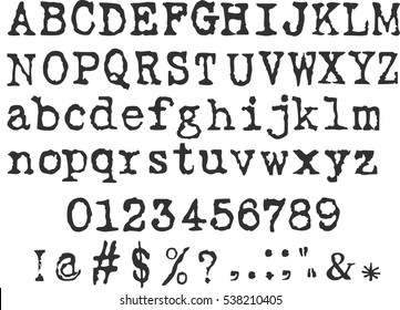 |
| https://www.shutterstock.com/search/typewriter+font |
Using the Typewriter font branches off the idea of the news print idea I originally had thought about. The graffiti idea, is based off an idea of vandalism, and using slut shaming slurs and putting them all around the painting so make it seems more ruthless and messy and more unintentionally put there. Unlike using the typewriter typography as it could come off as intentionally put there and glamorizing the slurs. Instead of putting them intentionally to create a statement.
I like the idea of the graffiti because of the vandalized feel it will have on the poster and how it will create an atmosphere when looking at the painting.
the main problem I am having as of now is, that I'm not sure how I want to present the final poster or what words to use for the final poster. As I already have made the sketch for the painting and have got the paper and ink, I just don't know how to present the final painting. I would like to do spray paint and poster over top as I think it will add to the painting. Creating it feel less like a fancy ink portrait and more casual, or creating an atmosphere for the works. To be able to do the spray painting, if I wanted it to be nice and clean I would have to make a stencil to spray onto, or I could not do a stencil and make it more messy and contradict the cleanses of the portrait. Which I think would be a good Idea to play around with, as well as the thought of making it more like an installation and creating a set for it to give it an atmosphere to it. To add to the way you view the work to create a more personal viewing.
the main problem I am having as of now is, that I'm not sure how I want to present the final poster or what words to use for the final poster. As I already have made the sketch for the painting and have got the paper and ink, I just don't know how to present the final painting. I would like to do spray paint and poster over top as I think it will add to the painting. Creating it feel less like a fancy ink portrait and more casual, or creating an atmosphere for the works. To be able to do the spray painting, if I wanted it to be nice and clean I would have to make a stencil to spray onto, or I could not do a stencil and make it more messy and contradict the cleanses of the portrait. Which I think would be a good Idea to play around with, as well as the thought of making it more like an installation and creating a set for it to give it an atmosphere to it. To add to the way you view the work to create a more personal viewing.


Comments
Post a Comment