Digital - Week 5 - 13/03/2019

The tutorial that we watched was quite helpful because it explained the use of colour and how it was used plus contexts with examples and explanation with the examples.
https://www.youtube.com/watch?v=Qj1FK8n7WgY&index=198&list=WL
I talked about each type of colour theory and how to use in context.
Saturation and value,
Is used to guide the viewer through an image or used as an "anchor".
Can be used to tell a story, and change the mood of the image.
Colour Harmony,
Colour harmonies are used together to create visually pleasing images. This is when you match up the colours by the colour wheel, though you never use the colours evenly you use one as a major colour and spread the others out in an unevenly matter.
Monochromatic is the use of one colour and using the saturation to change the vibrancy of the colour.
example:
 |
| Macniderart.org. (2019). Muffins & Monochromatic Painting | Charles H. MacNider Art Museum. [online] Available at: http://macniderart.org/sample-page/education/adult-classes/muffins-monochromatic-painting2/ [Accessed 14 Mar. 2019]. |
This is when adjacent colours are used together, though one colour will be the primary colour used in the image.
example:
 |
| Fine Art America. (2019). Analogous Figure by Erin Smith glenn. [online] Available at: https://fineartamerica.com/featured/analogous-figure-erin-smith-glenn.html [Accessed 14 Mar. 2019]. |
opposing colours, do not use evening, make one the main colour of the image and have the other as a secondary colour.
 |
| Mrknightart.com. (2019). Color Scheme Assignment | Mr. Knight Art. [online] Available at: http://www.mrknightart.com/?page_id=3683 [Accessed 14 Mar. 2019] |
Triadic Is the use of three colours. Triadic colours are chosen by using the adjacent colours but picking one of the two colours and using the colours either side of it and not the adjacent colour.
 |
Mrknightart.com. (2019). Color Scheme Assignment | Mr. Knight Art. [online] Available at: http://www.mrknightart.com/?page_id=3683 [Accessed 14 Mar. 2019]
|
Split complementary colours,
one complementary end extended.
 |
| https://i.pinimg.com/originals/bc/5a/ef/bc5aef7a88d0a8cf6ccf886bcf71aeb4.jpg |
Double complimentary,
Two pairs of opposing colours
 |
| Creativecolor.wordpress.com. (2019). Double Complementary Color Schemes | Creative Color. [online] Available at: https://creativecolor.wordpress.com/tag/double-complementary-color-schemes/ [Accessed 14 Mar. 2019]. |
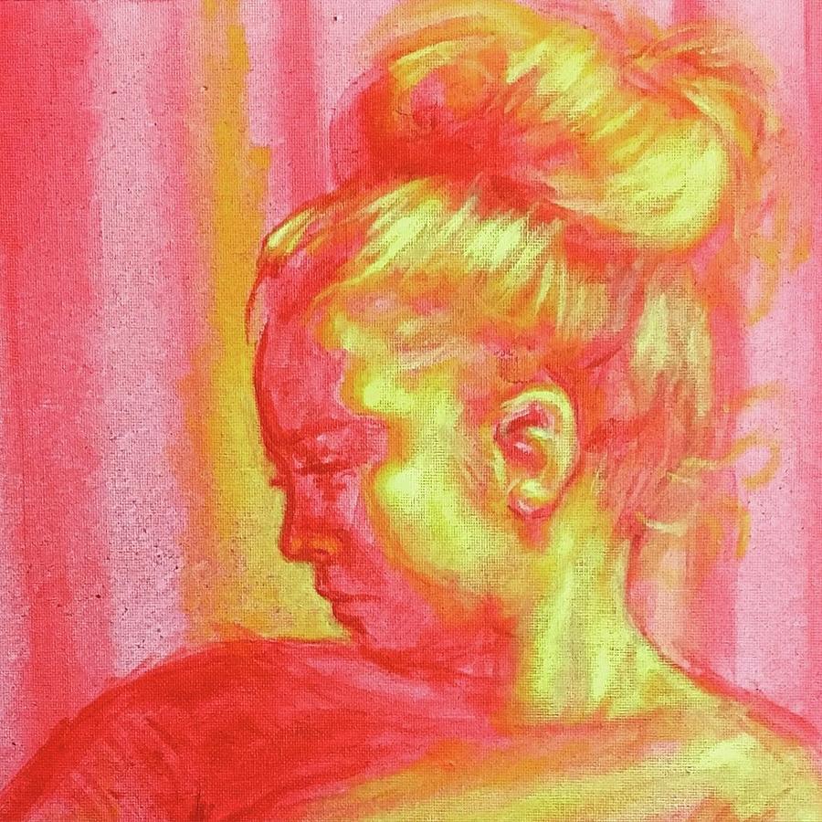
After viewing the videos and seeing the different ways of putting colour together affects the image. It is quite difficult to understand at first and now viewing an image I now can understand the use of saturation and why it is so important in painting.
Here are also some useful images that were provided in class to help further understand colour theory.


Comments
Post a Comment