Research - week 8+9 - 9/04/2019
Week 8 Critique


I do think I should have been more in depth with the process of these paintings and why they were important to paint on the slides and what the purpose of them were. As there was a lot of theory work and researching behind these paintings as I thought it was important to look more into researching and developing this year as I as didn't go into it deep enough, with the research and the reasons why I did things I also wasn't as experimental with placement and presentation and how I can manipulate things. I want to look thoroughly into the design aspect this year instead of committing to an aesthetic like I was last year, I found that because I was so committed to an Aesthetic I felt as if I couldn't change my designs a lot or I didn't have a lot of freedom because I want to commit to the aesthetic, I was also quite afraid of being different and to out there. This is key to why I am doing what I am doing this year, I am interested in seeing how far I can push myself with not just aesthetics but the development of the aesthetic and presentation. I have also looked into up scaling my work because I always just stick to just A4 and sometimes I do A3, I also don't experiment with what I painting onto and how to paint onto the canvas.
I talked to one of the workers at the art supplies stores, about what material I should paint on. He recommended hot press 50% cotton, and 50% -, it was recommend because of the smoothness and it wouldn't rip when using the calligraphy pen as that was one of the problems I was having with the calligraphy paper I was using for my tests. Though the paper does not come in traditional paper sizes. So I would have to rethink how I wanted to display my work and if I wanted to get it framed I would have to trim the paper or I could make a frame. As display is going to be important part of how the poster will be viewed and the message will be received by the viewer. I have started to think about displaying in correspondence with the graphic design. As it is part of how the message will be received and display is a key concept int graphic design. because I don't want to distract the viewer from the message of the poster, A minimalist frame will probably be the best for displaying the poster as It will not take attention away from the poster. the colour is also important as if I did certain colours it would distract the viewer from the poster. so a white, black or silver frame will be the best for displaying. This is because the poster is in black and white so it will be unnecessary to do a bold thick frame that takes attention away from the purpose of the poster.
what I have learnt from the presentation, is that a lot of people like the idea of empowerment and nudity together as a subject. also comment on how I need to narrow my focus down which I do agree on and I think is important due to the fact I am over whelming myself by doing to many things at once or wanting to do everything at once and getting side tracked. Finding myself just painting things that I like and it not corresponding to the study or thinking it does. Or it seems to not translate over to other people, maybe I'm not being straight forward enough with my works or being to shy with what I am producing and not being blunt enough? I also got recommended to do looking into non sexual poses and just doing an every day mundane things but with out glamorizing it. A good example of this shown from a fellow class mate is Joanna Thangiah, https://www.instagram.com/p/BuEI-KYH44j/ Her style and way of presenting her female characters are very straight forward and non glamorized way, they have body hair, exaggerated body, the breast are not perky and perfectly rounded they sag and are uneven. This was interesting to me to see a women present females like this, presenting herself or her female characters in such an non-glamorized way. This could be something I should have looked into what doing my testers because I did do a lot of glamorized works because that is what Pinup girls are like and that has what I based my works off. a lot of the people liked the bottom right drawing that was very confronting and was taking charge unlike the other which were very submissive, I think I will look into that a lot more as it seems to be popular and seems to be more communicating a message then the others. I also got comments of people wanting to see more self-love or self-empowerment, this I thought was interesting that a lot of people were telling me to look into one or the other. So I think I will look into self-empowerment since it seems to be the most popular one people are interested in and is the one that I can visually communicate the best. Another question I got was, if I was going to display these as a series of paintings and if they were going to be displayed next to the final paintings, I also got recommended to putting slogans on the small A4 that are related to each painting and then putting the big major painting is next to them. To show the development of the final one. Another good recommendation was to take a steep back and narrow down my inspirations and artist models to make a better foundation for my works so it will be clearer for the final project, this was probably the best advice I got given as I do think it is important that I take a steep back and reevaluate what I am doing making a solid clear foundation so that my final project will be more clearer and cleaning in the end result.
All this feed back was great and I think it did help a lot to have other artist point of viewers on my work to see if my study of visual communication was working or not and what was clear and what wasn't clear and how I could make a better foundation for my works.
So first thing I need to do is, solidify my foundation, make sure my artist model is clear.
Jean Giraud,

(Jean Giraud ,1990)
The reason why I picked him was because of his style, the scratchy style, and line shadowing. I also like the style he draws his females in.
Since I want to base my poster off a comic cover, I should have looked into his comic covers and see how it could correspond into my works. His Comics Moebius 1: Upon a star and the Long Tomorrow, are the two comics I quite like the most and will most.
This is the cover art he did for his comic Moebius 1: Upon a star
 |
| (Jean Giraud, 1987) |
I am wondering how I can my posters look like this and how I can make my portrait can pop off the background. How I can make the visual be the main attraction and not sink into the background or seem flat?
His covers also make you ask questions like, what are they looking at? what is so shocking? The character are not looking directly at the viewer. Is this relevant to my works though? how does this correspond to my works?
the reason why I chose the Young Love cover was more for the lay out and the aesthetic of the cover art, not for what the people were doing on the cover and what the female was going. I was more looking at the graphic design.
Now I have gone over my artist model and committed to this style and why I like it. I know have to make a commitment to a key idea, the idea that I will look into is self-empowerment. Why? This seems to be the main concept I keep going back to and is the one that I can seem to communicate the best, it also seems to be the most popular one that people seem to like with in my test paintings. The only example I could find of self-empowerment pinup girl is Rosie the Riverter. She very iconic and everyone knows who she is when you say her name. This I found quite interesting that I couldn't really find self-empowerment Pinup girls, in google images when searching self-empowerment pinup girls are just the traditional pinup girls. This left me in a rut, because I only have Rosie the Riverter as an example of self-empowering pinup girl or maybe the original purpose of Pun up girls have change with in time and are no longer used to bastardise the appeal of a woman's image. It is now seen as women expressing their sexuality? instead of being for men it has been claimed by women and they have embarrassed pin up girls and turned it into empowerment of their sexuality? This means the flirtatiousness and sexualness in the pinup girl posters are now for themselves not for the male gaze.
After looking into self-empowerment I will look into, refining my question that I have originally done which is How can I reverse the original purpose of “pinup”, “sex sell”, to a political statement of “what I wear isn’t consent” through an Ink poster self portrait, that shows empowerment in self and sexuality that is also modern in perspective? into what I have narrowed my studies down to.
So I am looking into self empowerment and pinup girls, and I am creating an ink self portrait from this idea.
How can I express self-empowerment through a pinup self portrait ink poster?
The idea of Self-empowerment is very similar to the idea of self-love. Maybe I was just over complicating this project and should have just tried to do a more simplified approach to this project instead of pulling everything apart and being to over complicated with this project.
So where I am I now?
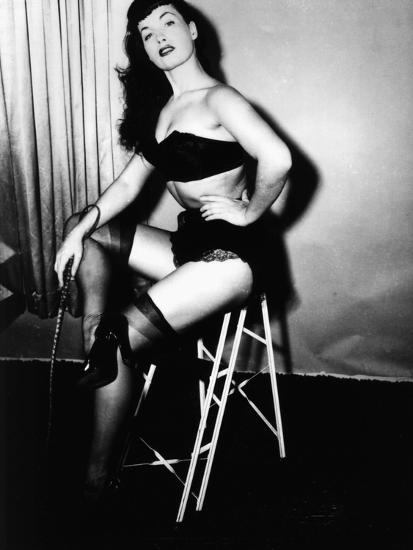
I have already done one final test and I hate it. I wanted to do one submissive and no provocative and in your face which was this one, and I don't like it. It doesn't seem to send a cohesive message and the drawings do not connect with the text. It also deals with a lot of empty spacing and the text doesn't seem to work very well with the image. This wasn't a successful test though I am glade I did it because now I know the submissive non-provocative way is not the way to go with this project. So in my next test painting I Will be looking into provocativeness and being confronting as it seems to be the easiest way to get a message across. Though I didn't originally want to go the provocative way, but now that my question has changed to expressing self empowerment I think this is a good way to go around it. Though I do like the doll like style when it comes to drawing and I would like to continue that style and look into it more and how I can develop it more. I also want to look into basing the lay out of my next poster on the Young Love comic. Though the image of the poster will be a drawing of myself. I have looked into some pinup posters of Bettie Page from some inspiration. I have found some images that I would like to base my drawings off as I can see them being empowering and I would like to alter and adjust them to be more confronting.


Hi there Britney. Last term ended up pretty heavy for you. Hopefully you're refreshed and clear about your project for the next term.
ReplyDeleteYour blogging is extensive and interesting to read more about your thought processes and ideas. I liked the link to Joanna Thangia and the informality of her work. Is there something in this for you in your work? I'm aware that you wish to keep to the formalities of your artist models, consider how you can update these conventions to subvert and question those formalities.
Some ideas and practitioners to consider;
https://www.theguardian.com/stage/2019/apr/11/betty-grumble-i-want-to-tell-stories-ferociously-from-my-guts?CMP=Share_AndroidApp_Email
https://www.theguardian.com/artanddesign/gallery/2019/feb/27/stripteases-surrealists-body-observed-magnum?fbclid=IwAR1zwKzNRdNKWA9tqfutH4BxbFgUnMJ8c690VKb-OT3zqj2O_3q5lHNejlo